

It’s 2017, and “mobile first” isn’t just that thing that’s “nice to have” any more. It’s become expected that you’re going to provide a consistent experience to your end users whether they’re hitting your site on their desktop, phone, heck even their watch!
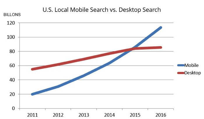
It’s pretty clear by now that this “mobile trend” isn’t going away any time soon, in fact the numbers show that the vast majority of users are reaching to multiple devices (phone, tablet, and desktop) to interact with your site. (Image courtesy of Smart Insights)
But after digging through our own numbers we were surprised to find that, despite the dramatic shift of consumers viewing the world wide web through the supercomputers in their pockets, our customers are still testing the desktop-based experience on their websites and applications over mobile by a vast majority.
When it comes to responsive web design, it’s essential that testers incorporate a robust mobile-testing strategy into their testing workflow. Whether users are viewing the mobile version of your site on a smaller screen or navigating your UX design on larger screens like desktops and tablets, it’s important that your layout doesn’t negatively impact their user experience. Read on to learn how you can streamline responsive web design testing with Ghost Inspector.
Table of Contents
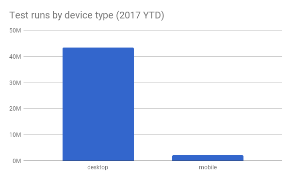
Ghost Inspector test run stats
Out of the 45 million tests we’ve run this year, less than 5% are being run with mobile in mind. Now, granted, not all of our customers will be offering a mobile-responsive version of their web application or site, but still, the “mobile test runs” numbers are a lot lower than we expected.
Here’s a breakdown of test runs so far this year by desktop vs. mobile device:
Here’s the same data broken out month over month:
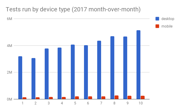
While there is the slightest uptick in mobile test runs, it’s pretty clear that our users are taking a very “desktop-centric” approach to web site and application testing.
How do I test my responsive design?
This part is actually quite simple: Ghost Inspector provides a very tidy solution to this problem called “viewports”, an option that is available at both the Suite and Test level. But we’ll come back to that in a second. First…
Let’s record a test!
Let’s get started by recording our first responsive test. Since you’re already using our test recorder in Chrome (you are, aren’t you?) we will use another feature in Google Chrome called Device Toolbar.
Device Toolbar
To activate the Device Toolbar, we first need to open Developer Tools (Hamburger > More tools > Developer tools) and toggle the Device toolbar icon.
Now, Chrome has modified our browser viewport to mimic mobile resolution, and we should see our responsive design in the window! From here, we can also select a device preset within the Device Toolbar or enter custom dimensions. I’ve selected iPhone 6 375×667. You’ve probably noticed that the mouse cursor has turned into a semi-transparent grey circle which represents where you will touch (click) the interface.
Next, we can fire up our test recorder extension as usual and start making some assertions!
As you navigate your site or application, our test recorder will capture your events just as it would when you navigate the desktop version. When you’ve finished recording your steps and assertions, give the test a name, select the Suite you want to save it to, uncheck Execute initial test run, and click Save this test.
Let’s see all of that in action:
Adding the finishing touches
Once we view our test Ghost Inspector app, we can set the screen size for our test in the Test Settings (Settings > Display Options > Screen Size. I’ve selected 375 x 667 – Apple iPhone 6 (Portrait), which is the same resolution I used to record the test. Now, click Save Changes and run the test! When your test is executed in our cloud infrastructure, the viewport of our test runner’s browser will be set to the dimensions you’ve selected.
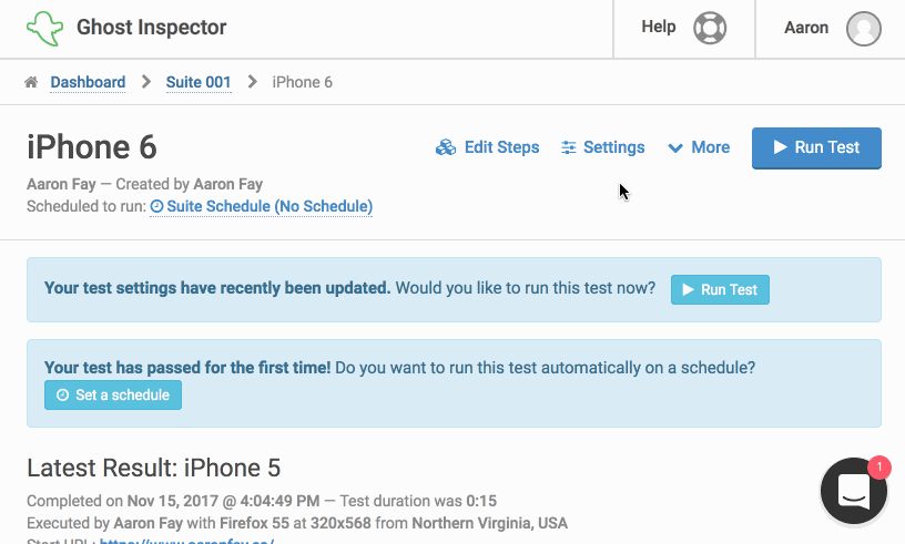
Now, our test should run, and when it’s finished, we can inspect the steps, video, screenshot, and console output just like any other test.
Suite-level display options
You also have the option to set the screen size defaults at the Suite level (Settings > Test Defaults > Display > Screen Size). Setting this value will provide a default viewport size for all subsequent tests within the suite, unless you override at the test level.
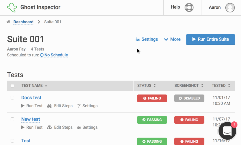
We’ve provided a number of presets that you can select to mimic a visitor’s user experience viewing your site on different devices:
Available viewport sizes:
- 320 x 480 – Apple iPhone 4 (Portrait)
- 320 x 568 – Apple iPhone 5 (Portrait)
- 360 x 567 – Android Small (Portrait)
- 375 x 667 – Apple iPhone 6 (Portrait)
- 384 x 640 – Android Medium (Portrait)
- 412 x 659 – Android Large (Portrait)
- 414 x 736 – Apple iPhone 6+ (Portrait)
- 480 x 320 – Apple iPhone 4 (Landscape)
- 567 x 360 – Android Small (Landscape)
- 568 x 320 – Apple iPhone 5 (Landscape)
- 640 x 384 – Android Medium (Landscape)
- 659 x 412 – Android Large (Landscape)
- 667 x 375 – Apple iPhone 6 (Landscape)
- 736 x 414 – Apple iPhone 6+ (Landscape)
- 768 x 1024 – Apple iPad (Portrait)
- 800 x 600 – Desktop (Small)
- 1024 x 768 – Desktop (Medium)
- 1280 x 800 – Desktop (Large)
- 1280 x 1024 – Desktop (Large)
- 1366 x 768 – Desktop (Large) *
- 1440 x 900 – Desktop (Large) *
- 1600 x 900 – Desktop (X-Large) *
- 1600 x 1200 – Desktop (X-Large) *
- 1920 x 1080 – Desktop (HD) *
* available under paid subscription
Modify viewport through the API
And if that wasn’t good enough, you also have the ability to modify the viewport of a test at will through our API as well. Here’s an example using curl:
$ curl -s https://api.ghostinspector.com/v1/tests/{{testId}}/duplicate/?apiKey={{apiKey}}&viewport=375x667
This API call will request that the test be executed with a viewport of 375x667, simulating our iPhone 6. Head over to our our API for more details.
Wrapping up
And that’s it! We hope that this post has given you some ideas about how to approach testing your mobile or responsive website design and that these options will give you greater flexibility when it comes to your mobile-first strategy. Here are a few tips to keep in mind while testing:
- Try to keep your tests as short as possible, 25-30 steps is often ideal.
- You can build assertions around what is not present on the page as well as what is.
- Import reusable test steps to keep your test suites more maintainable.
- Check with your analytics provider to understand your visitors’ most common devices and craft your tests to match.
As always, if you get stuck or have any questions, drop us a line on the support channel and we’ll be happy to help! And if you’d like to learn more about automating your QA testing workflow with Ghost Inspector, you can book a demo with us here!
Happy Ghosting!
